A candlestick chart, a type of financial chart, displays changes in a currency’s, a security’s, or a derivative’s price. It resembles a candlestick because of its vertical rectangle and wicks at the top and bottom. The top and bottom of the candlestick represent the open and closed prices, respectively. The wick’s top and bottom represent, respectively, the high and low prices.
These charts that display market volatility and trends can be a helpful tool for traders and investors who want to perform a thorough analysis before making an investment. Technical analysis using candlesticks must be a part of every trader’s strategy for determining when to enter and exit trades.
Candlestick Chart Definition
A candlestick chart displays price movements thru plotting of open, high, low, close prices of stock, currency or derivative on the chart. In other words, candlestick chart is designed by merging line chart and bar chart patterns. Candlestick charts are more commonly used in technical analysis of stocks.
Now we have understood what the line charts and bar charts in previous chapter of tutorial, the next thing is the candlestick pattern. In this chapter, we will let you know what a candlestick chart pattern is and how it’s different from a line chart or a bar chart.
However, it isn’t much difficult to understand, let us know a bit about the history of candlestick charts and how did it come into practice.
History of Candlestick Chart Pattern
The history of candlestick pattern starts from the 16th century. In early 1600’s, the candlestick charts are assumed to be used for trading rice in Japan. In Japanese method of technical analysis, it is called the ‘candlestick Pattern’ or simply the ‘Japanese Candle’.
Till 1710, only the physical rice trading was taking place, but then came the concept of a ‘coupon’, with a promise to provide rice in near future. This gave the birth to future trading.
Homma Munehisa (1724-1803), was a rice trader from Sakata, Japan, is known to be the person who brought the candlestick pattern into practice. He organized this ancient wisdom and made use of Japanese candlestick charting, which became a big success. Later in 1980’s Steve Nison wrote a book on candlestick patterns naming, “Japanese Candlestick Charting Techniques”, which is still referred by the traders to get the basics of candlestick charts.
Technical Analysis: Candlestick Chart Anatomy
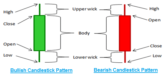
A candlestick chart isn’t much different from a bar chart. The main difference is that in a candlestick chart the opening and closing prices are shown by a rectangular body, instead of a left and right tick on the central line.
The candles in a candlestick chart can be classified into bullish and bearish candles, similar to the bars in a bar chart. Let’s have a look.
Bullish Candlestick Pattern
In a bullish candle the closing price of a stock is always higher than the opening price. There are 3 main components in a bullish candle:
- Central Body:It’s a rectangular body that connects the opening and closing price of a stock.
- Upper shadow: It indicates the high point where a stock closed.
- Lower Shadow: It indicates the low point where a stock opened.
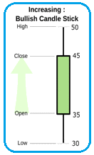
In the image shown, we can see that the candle in green color is a bullish candle as the closing price (Rs.45) is on the upper shadow and the opening price (Rs.35) is on the lower shadow.
Bearish Candlestick Pattern

In a bearish candle the opening price of a stock is always higher than the closing price. There are 3 main components in a bearish candle:
- Central Body:It’s a rectangular body that connects the opening and closing price of a stock.
- Upper Shadow:It indicates the high point where a stock opened.
- Lower Shadow: It indicates the low point where a stock closed.
In the image displayed, we can see that the candle in red color is a bearish candle as the opening price (Rs.65) is on upper shadow and the closing price (Rs.55) is on lower shadow.
Example of Candlestick Chart Pattern
Now you have understood the differences between a bullish and a bearish candle, let us have a look on a real candlestick chart of a stock.
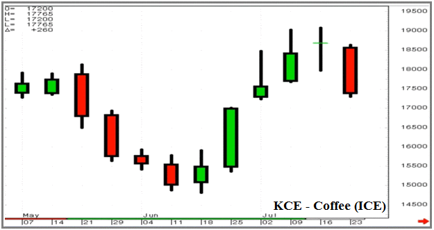
Here is a candlestick chart of stocks of KCE Coffee for 07th May to 16th July. We can see the weekly candlestick chart for closing and opening prices as each candle indicates the fluctuations in the stock prices during a week.
Let us take an exercise to understand the concept in an easier way. We will randomly choose two candles and referring the chart, we will determine the OHLC data of each candle. We picked two candles for 21st May and 25th June respectively.
The candle for 21st May is in red color. Hence, we can have an idea that it’s a bearish candle. Therefore, the upper shadow will indicate the opening price and the lower shadow will indicate the closing price of the stock.
The OHLC data for 21st May will be:
| Open | High | Low | Close |
| 17,800 | 18,200 | 16,500 | 16,700 |
Similarly we can get the OHLC data for 25th June also. The candle for 25th June is in greencolor and we can say that it’s a bullish candle. Therefore, the upper shadow will indicate the closing price and the lower shadow will indicate the opening price of the stock.
The OHLC data for 25th June will be:
| Open | High | Low | Close |
| 15,500 | 17,100 | 15,300 | 17,000 |
In a candlestick chart, a candle with a longer body portrays a more selling or buying activity and a candle with a shorter body portrays a less trading activity. With this concept, we can track the trading activity of a stock for a month, six months or even a year. In next chapter will discuss the various types of candlestick patterns including the single candlestick and multiple candlestick patterns.
Read E-Learning Tutorial Courses - 100% Free for All
Basics of Technical Analysis for Beginners
- Chapter 1: What is Technical Analysis? Definition with Examples
- Chapter 2: Technical Analysis: Types of Technical Chart Patterns
- Currently Reading: What is Candlestick Chart? Definition with Examples
- Chapter 4: Types of Single Candlestick Patterns. Definition with Examples
- Chapter 5: Definition, Examples, Types of Multiple Candlestick Patterns
- Chapter 6: What is Support and Resistance? Definition and Examples
- Chapter 7: What is Volume? Definition with Examples of Indicators
- Chapter 8: What is Moving Average? Definition, Examples, Types and Strategy
- Chapter 9: What are Technical Indicators? Definition with Examples
- Chapter 10: Different Types of Technical Indicators with Examples
- Chapter 11: Basics of Technical Analysis Quiz - Question and Answers