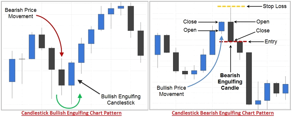
A price chart’s shape known as a “chart pattern” makes predictions about future price behavior based on past performance. Chart patterns are the foundation of technical analysis, therefore a trader must be aware of both what they are looking at and what they are looking for. Let us understand types of technical chart patterns in this technical analysis session.
A line connecting frequent price points, such as closing prices, highs, or lows over the course of a specific time period defines a pattern. Technical analysts and chartists look for patterns to predict the price movement of a security in the future. These formations can be as simple as double head-and-shoulders or as complex as double head-and-shoulders.
The Concept of Technical Charts
The concept of charts has come in existence to summarize the trading action for a certain time-frame. Each trading has mainly four data points: Open (O), high (H), low (L), and close (C). We will denote these four data points with OHLC, commonly known as technical chart pattern. If we want to look at the trading action of a stock for a week, each day will have four data points and hence there will 28 (4 data point x 7 days) data points.
Similarly, we can draw a technical chart for the trading action of a stock for the whole day, mentioning the four data points for each hour of the day. Hence you can get understanding how complicated it would be, when we will try to summarize the trading action of a stock for a month, six months or a year. In previous chapter, we learnt about what is technical analysis through examples. In this chapter, we will explain how to look at a technical chart patterns and why traders use different charts.
Types of Technical Chart Patterns
Now you have got that why traders use the charts to summarize the trading action of a stock. But each and every chart cannot be used for the purpose. Various general charts such as pie chart, column chart, and area chart may not be useful for technical analysis. This is because it requires four data points at same time but these charts express only one data at a time.
Now we let you know what the charts that traders use for summarizing the trading action of a stock are. Some of such types of charts are named below:
- Line Chart.
- Bar Chart.
- Candlestick Chart.
In this chapter, we will give you a brief explanation of above mentioned charts and will also let you which chart is more preferred by traders.
What is Line Chart?
A line chart consists of various data points (one data point at a time) that are connected by a line. Generally, it’s used to show the closing price of a stock for the day or the week. In a line chart, each closing price is shown by a dot and the dots are connected to create a line.
Let us take a line chart example to understand the concept with a line chart for the closing prices of a NIFTY.
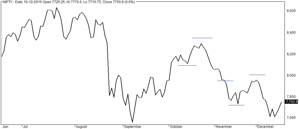
Here, the above line chart shows the closing prices of a NIFTY from June to Decemeber. The technical chart shows the fluctuations the closing prices of the nifty index at different days. We can see the highest closing price for the nifty was close to Rs.8,633.50 on 22th of July. While the lowest closing price for the nifty was close to Rs.7,558.80 on 7th September.
The main advantage of this technical chart is its simplicity. You can easily observe what the highest closing price was, what the lowest closing price was and how did it fluctuate throughout the time period. However, the chart isn’t much commonly used by traders as it doesn’t show any information except the closing price of a stock.
What is Bar Chart?
A bar chart is a chart made up of grouping of data into rectangle bars where length of bar represent the values. A bar is little more versatile than a line chart. This is because it shows the opening price, highest price, lowest price and the closing price of a stock. Let us understand how a bar chart is. A bar is made of three components-
- Central Line: The top of the central line shows the highest price of a stock and the bottom of the central line shows the lowest price of a stock.
- Left Mark / Tick: The left tick on the central line shows the opening price of a stock.
- Right Mark / Tick: The right tick on the central line shows the closing price of a stock.
Let us a bar chart example to understand the concept with a bar chart for the OHLC data of a stock.
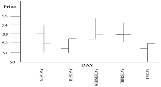
In the above bar, we can see five bars showing the OHLC data of a stock for Monday to Friday. On Monday, we can see the lowest price is Rs.51 and the highest price is Rs.54. The opening price of the stock is Rs.53 and the closing price of the stock is Rs.52. Let us further understand about what the bearish and bullish bar charts are.
Bearish Bar Chart
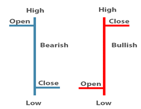
In a bearish bar, the opening price of a stock is always higher than the closing price of the stock. We can see that the bar chart Monday is a bearish bar. This is because the opening price of the stock (Rs.53) is greater the closing price of the stock (Rs.52).
Bullish Bar Chart
In a bullish bar, the closing price of a stock is always higher than the opening price of the stock. We can see that the bar chart Tuesday is a bullish bar because the closing price of the stock (Rs.52.50) is greater the opening price of the stock (Rs.51.50).
But a bar chart also has its disadvantage. It’s little difficult to spot the potential pattern developing for a stock. And hence the traders don’t use this technical chart frequently. Traders prefer to use a candlestick chart to get the potential pattern of a stock. In next chapter, we will discuss why they do so.
Read E-Learning Tutorial Courses - 100% Free for All
Basics of Technical Analysis for Beginners
- Chapter 1: What is Technical Analysis? Definition with Examples
- Currently Reading: Technical Analysis: Types of Technical Chart Patterns
- Chapter 3: What is Candlestick Chart? Definition with Examples
- Chapter 4: Types of Single Candlestick Patterns. Definition with Examples
- Chapter 5: Definition, Examples, Types of Multiple Candlestick Patterns
- Chapter 6: What is Support and Resistance? Definition and Examples
- Chapter 7: What is Volume? Definition with Examples of Indicators
- Chapter 8: What is Moving Average? Definition, Examples, Types and Strategy
- Chapter 9: What are Technical Indicators? Definition with Examples
- Chapter 10: Different Types of Technical Indicators with Examples
- Chapter 11: Basics of Technical Analysis Quiz - Question and Answers

